Community
Enhancing Document Design Skills #1: Developing Color Sense
- AuthorAdministrator
- Date2022.10.24
Enhancing Document Design Skills #1: Developing Color Sense
PowerPoint is a visual document tool that emphasizes text content through various shapes and images. However, one common characteristic among many users is the excessive use of vibrant colors. Adding too many colors can make slides look cluttered and reduce focus. Therefore, for clean and professional document design, it’s important to experiment with color combinations and practice finding harmonious and natural color schemes.
There are moments when a sense of color is essential in document creation—especially for reports, proposals, or layout drafts for asset production. While content structure is the most critical aspect, color combinations and placement are often necessary to make the document look polished, sophisticated, and clear.
Color is a powerful means of conveying information and influences human psychology. Misunderstanding color or failing to use its impact effectively can have negative consequences.
This article focuses on understanding color and developing color sense.
Color theory begins with basic concepts such as hue, value, and chroma. Neutral and chromatic colors, hue, brightness, and saturation are widely used in everyday life and design. These principles are useful not only for design but also for creating PowerPoint presentations and visually rich documents.
Definition of Color:
Color is a type of visual sensation created when light stimulates the human eye.
Three Physical Elements of Color Perception:
1. Light source
2. Object
3. Visual response (eye)
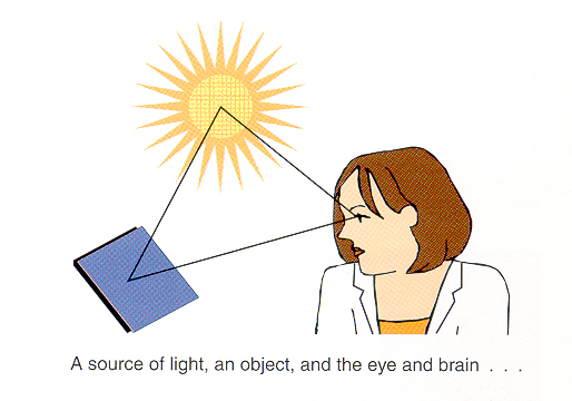
[Figure 1] Three Physical Elements of Color Perception
To perceive color, all three elements—light, object, and eye—must be present. If any one is missing, color cannot be perceived.
Attributes of Color
- Hue: The name of the color, distinguishing it from others.
- Value: The relative lightness or darkness of a color.
- Chroma: The purity of a color; high chroma indicates vivid colors, low chroma indicates dull colors.
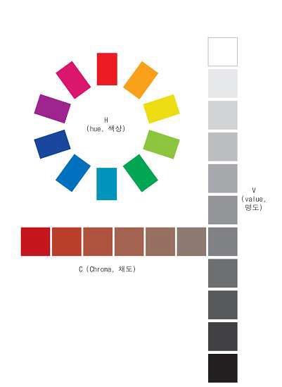
[Figure 2] Three Attributes of Color
Based on these fundamentals, I’ll share how I studied and applied color placement in my work.
Colors exist as elements that must be arranged with proper emphasis and balance. Even as a color design major, I find it challenging to instantly visualize harmonious color combinations. If colors are poorly chosen—regardless of layout quality—the design can suffer from visual dissonance, making it look awkward or “off.”
Improving your ability to understand and use color allows you to capture attention and create different moods and atmospheres. Simply mastering color can elevate your document design significantly..
Helpful Color Combination Resources
Several websites provide useful tools for finding color combinations:
1. Adobe Color (https://color.adobe.com/ko/create/color-wheel)
Create color palettes using a color wheel or images, and explore thousands of color combinations.
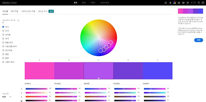
[Figure 3] Adobe Color
2. Color Hunt (https://colorhunt.co)
Displays color palettes for various moods and seasons.
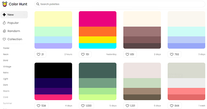
[Figure 4] Color Hunt
3. LOL Colors (https://www.webdesignrankings.com/resources/lolcolors/)
Shows color combinations in droplet shapes, often used for graphs and statistics.
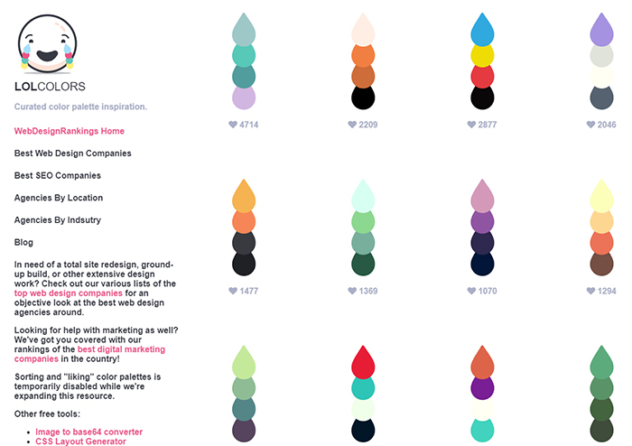
[Figure 5] LOL Colors
4. UI Gradients (https://uigradients.com/#AzurLane)
Offers gradient color combinations and provides CSS code for easy implementation.

[Figure 6] UI Gradients
Among these, Adobe Color is my most frequently used tool. Before starting any design project, I use it to decide main and secondary colors. The Color Harmony Rules feature helps maintain balance based on a selected base color.
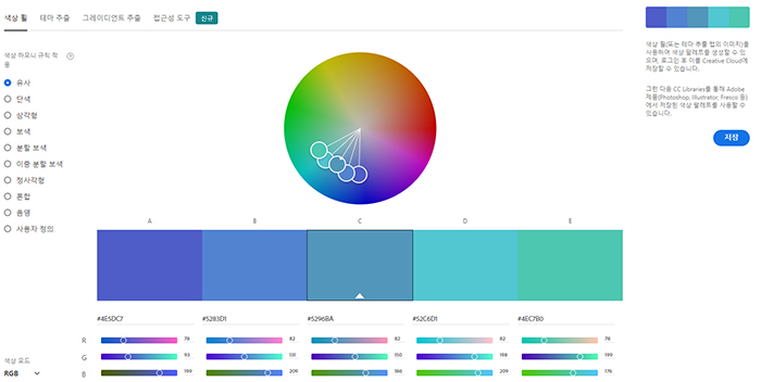
[Figure 7] Adobe Color Color Wheel
Additionally, the Theme Extraction feature analyzes images to extract color themes.
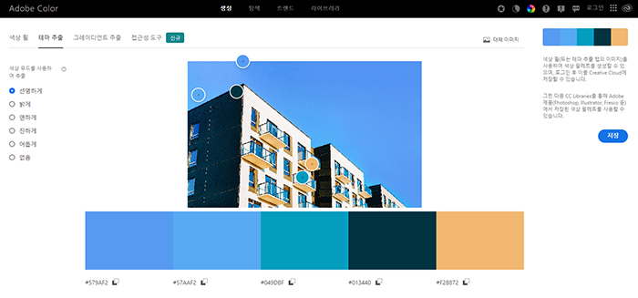
[Figure 8] Adobe Color Theme Extraction
Adobe Color also includes an Accessibility Tool that checks contrast ratios and font size recommendations for readability. If a combination fails, it indicates poor readability.

[Figure 9] Adobe Color Accessibility Tool
Applying Color Combinations to Documents
Follow the Three Principles of Color Usage:
1. If you lack color sense, use neutral colors and adjust brightness for variation.
2. Avoid pure primary colors; if necessary, soften them by adjusting tones.
3. Use one accent color to create unity.
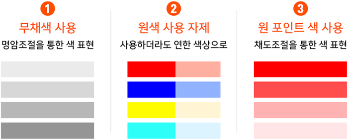
[Figure 10] Three Principles of Color Usage
When unsure which colors to choose, try these Four Color Combination Methods for inspiration.

[Figure 11] Four Color Combination Methods
If you feel your sense of color is lacking, use the four recommended websites to explore and extract color palettes. Draw inspiration from professional palettes and image moods to create your own combinations.
By learning effective visualization techniques, you can upgrade your design skills and create high-quality documents with stylish color schemes.
This article introduced helpful resources for color combinations and practical tips for applying them to PowerPoint and document design. Now, go ahead and design visually appealing documents with smart color choices!
Na Sujin, Solution Service Division – PSP Team, STEG Inc.